5 Pro Tips on How to Choose a Logotype for Premium Branding 2026
Struggling to figure out how to choose a logotype that looks expensive?
Figuring out how to choose a logotype is often the most frustrating part of a branding project. You want something that screams “premium” and looks effortlessly timeless, but you end up scrolling endlessly through free font sites. The result? Wonky kerning that takes hours to fix manually, and that lingering anxiety about whether the font is actually legal for your client’s commercial use. If you’re tired of second-guessing your typographic choices and want to charge higher rates for your branding packages, you need a foolproof strategy to pick the right assets. Let’s dive into how the pros do it.
1. Match the Font to the Brand Arch
A logotype isn’t just a readable word; it’s the visual voice of the company. Before you even open your design software, pin down the brand’s personality.
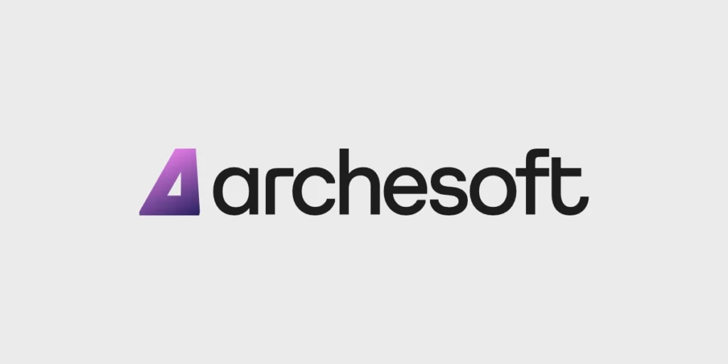
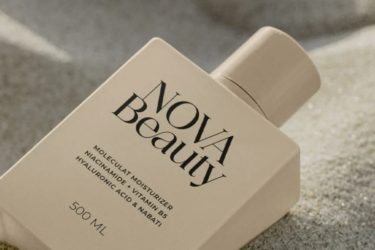
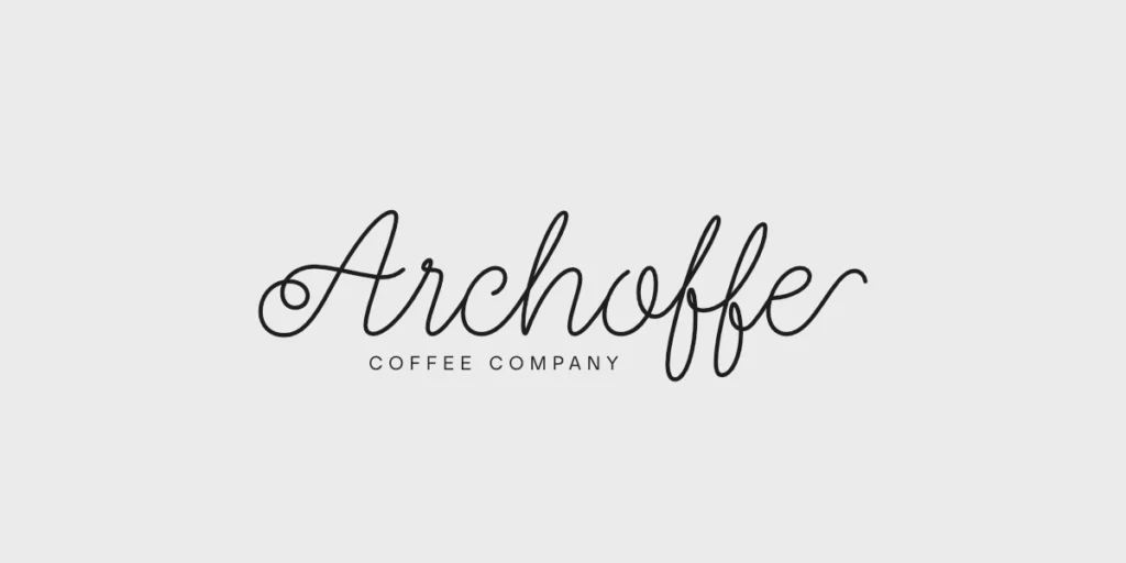
If you’re dealing with a fast-paced tech startup, a clean, modern geometric sans-serif is usually your best bet. It communicates efficiency and forward-thinking. On the flip side, if your client is an artisan coffee roaster or an organic skincare line, introducing a highly crafted handwriting font provides that warm, human touch that consumers crave.
2. Inspect the Technical Precision (The Maker’s Secret)
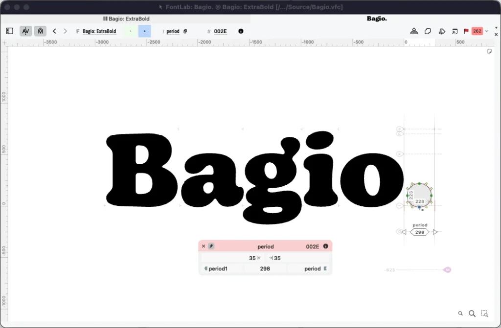
Here is a hard truth from the industry: cheap fonts look cheap because they are rushed. When you are building a logotype, the technical foundation of the font matters just as much as its aesthetic appeal.
Crafting a truly premium font family isn’t a weekend job. It takes about four solid months of intensive production to develop a flawless typeface. This includes extreme precision engineering using industry-standard tools like FontLab 8. When you select a logotype, make sure the kerning and ligatures hold up perfectly when imported into your workflow, whether you’ve made the switch to Affinity Designer or are still relying on Photoshop.
Stop Risking Your Client’s Business with Bad Licenses
Don’t let a $5,000 branding project get ruined by a massive copyright infringement lawsuit. Using “free for personal use” fonts for a client’s logotype is a ticking time bomb. Always secure the proper rights before finalizing a design. Read up on exactly what you need to stay safe and profitable on our Licensing.
3. Test for Extreme Scalability
A great logotype needs to be a chameleon. It has to look absolutely stunning as a tiny favicon on a mobile browser and equally striking when plastered across a massive highway billboard.
When testing potential fonts, always zoom way out. Do the counters (the enclosed spaces in letters like ‘e’ or ‘a’) fill in and look like black blobs? If so, ditch it. Fonts like Baru Sans are specifically engineered to maintain perfect legibility and structural integrity no matter the scale, giving your logotype maximum versatility.
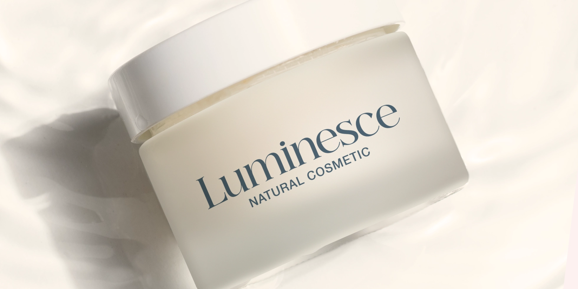
4. Evaluate the White Space Ratio
Negative space is just as important as the letterforms themselves. When selecting a typeface for a logo, pay attention to the breathing room between the characters.
A premium logotype often utilizes a generous amount of white space, which naturally elevates the perceived value of the brand. It feels less cluttered, more confident, and inherently luxurious. When you create your presentation mockups, remember to utilize a 1:1 ratio with plenty of margins to let the logotype truly shine for your client.

Ready to Upgrade Your Typography Arsenal?
Stop wasting billable hours trying to fix the kerning on subpar, legally questionable fonts. Give your clients the premium aesthetic they are paying for, with zero licensing headaches.
Browse our exclusive collection of meticulously crafted typefaces. Get instant access, secure commercial rights, and easy checkout via PayPal. Head over to the Kereatype Font Catalog right now and find the perfect logotype for your next big project!