Font Pairing for Branding: A Practical Guide
A strong brand needs typography that works beyond the logo. Learn how to assign font roles, compare proportions, and test a pairing across everyday brand applications.

Font pairing for branding starts with deciding what each font needs to do. One might carry the personality of a headline, while another makes product details, paragraphs, and navigation easy to follow.
A combination can look convincing in a specimen and still struggle on a real website or label. The useful question is whether the fonts work together across the things your brand actually needs to communicate.
This guide takes you through choosing roles, balancing contrast, and testing a combination before it becomes part of your brand guidelines.
Start with the Jobs Your Typography Must Do
Before comparing typefaces, list the kinds of text your brand uses.
A small skincare business might need a wordmark, product names, ingredient information, website headings, and short social captions. A design studio might rely more on project titles, long case studies, navigation, and presentation decks.
These needs give you a practical starting point:
| Role | What to look for |
|---|---|
| Brand headlines | A distinctive voice that suits short, prominent messages |
| Body text | Comfortable reading in the intended layout and size |
| Labels and navigation | Clear words that remain usable in limited space |
| Prices and specifications | Numerals, symbols, and punctuation that handle real information |
One typeface may cover several roles. You do not need a separate font for every item in the table.
If you are still choosing the central voice of your identity, begin with our guide to choosing a logotype for branding. Once that direction is clear, evaluate how the supporting typography should relate to it.
Build Font Pairing for Branding Around Clear Roles
Start with one leading typeface and one supporting typeface.
The leading face can bring the strongest personality. The supporting face needs enough flexibility to handle the information around it.
For a hypothetical boutique hotel, the division might look like this:
- An expressive serif for campaign headlines and room names.
- A restrained sans serif for booking details, descriptions, and navigation.
The division can also work in reverse. A bold sans serif might lead a contemporary identity, with a serif reserved for longer editorial stories.
Write the roles down before adjusting individual layouts. “Font A handles headlines; Font B handles paragraphs and labels” is a useful rule that another designer can apply.
Look Beyond Serif Versus Sans Serif
A serif and a sans serif provide an obvious starting point for contrast. Their classifications alone do not tell you whether the combination will suit your project.
Compare the actual letterforms.
Proportions: Does one typeface look unusually narrow or wide beside the other? Different widths can create useful contrast, but test how they affect line breaks and layout balance.
Lowercase height: Two fonts set at the same numerical size can appear noticeably different in size. Compare a few lowercase words and adjust by eye.
Stroke contrast: A serif with delicate thin strokes creates a different relationship with a sturdy sans serif than with another delicate face.
Overall mood: Decide whether the combination supports your brief. A playful headline and a formal supporting face may create an interesting tension, but that tension should serve the brand.
Use these observations to make deliberate choices. There is no requirement for two fonts to share identical proportions or belong to different classifications.
A Serif and Sans Serif Pairing to Explore
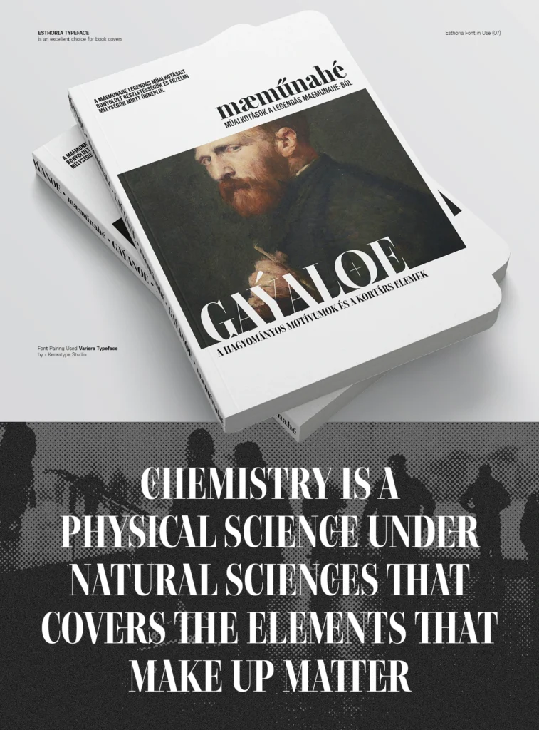
For a starting experiment, consider Esthoria for prominent headlines and Baru Sans for supporting information.
Esthoria’s high-contrast serif design offers a strong direction for editorial headlines. Baru Sans brings a geometric sans serif structure that you can explore for paragraphs, labels, and navigation.
The proposed division is:
| Element | Starting choice | What to test |
|---|---|---|
| Main headline | Esthoria | Thin strokes, line breaks, and overall presence |
| Short introduction | Baru Sans | Balance beside the headline |
| Body paragraphs | Baru Sans | Reading comfort at the intended size |
| Navigation and labels | Baru Sans | Clarity in compact spaces |
| Editorial accent | Esthoria | Whether it reinforces the hierarchy |
Treat this as a test brief. It does not establish that every style or size will work equally well in every application.
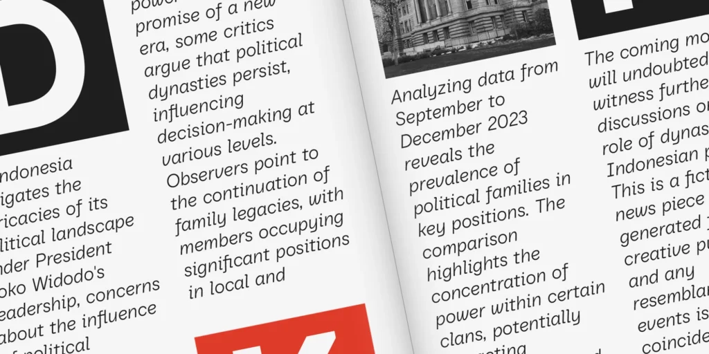
Begin with a short headline and a real paragraph. Adjust their sizes until they feel balanced, then add the smaller information. If the body text feels weak beside the headline, try its size and weight before introducing another typeface.
Test with Real Content
A font combination should survive ordinary brand communication.
Build a small sample containing:
- Your actual brand name.
- One short headline and one longer headline.
- A paragraph of realistic copy.
- A button or navigation label.
- A price, date, or product specification.
- Any accents and language-specific characters the project needs.
For a fictional homeware brand, you could use:
Headline: Objects for everyday rituals
Paragraph: Explore considered pieces for the spaces you use most, from the first cup of coffee to the last light of the evening.
Button: Explore the collection
Product detail: Stoneware cup · 250 ml · $28
This sample reveals more than two attractive font names placed side by side. You can inspect wrapping, punctuation, numerals, and the relationship between expressive and functional text.
Replace the example with your own content before making a final decision.
Check the Smallest and Most Demanding Applications
A large presentation slide can hide problems that become obvious in everyday use.
Review the pairing on the smallest screen layout you expect people to use. For print, make a proof at the intended physical size.
Pay particular attention to:
- Thin strokes that become difficult to see.
- Small text that feels cramped.
- Long product names that wrap awkwardly.
- Labels that lose clarity against their background.
- Headlines whose spacing looks uneven at display size.
For websites, test in the actual browser layout when possible. For packaging, use the real label dimensions.
If a delicate headline face struggles at small sizes, keep it in larger roles and let the supporting face handle the details.
Fix Hierarchy Before Replacing the Fonts
Sometimes the fonts are suitable, but their treatment makes the combination feel unsettled.
When everything competes for attention, reduce the emphasis of secondary elements. A subheading may need less weight, less size, or more space around it.
When the two fonts seem disconnected, check their apparent size and alignment. Equal point sizes do not guarantee equal visual presence.
When the page feels busy, simplify the number of treatments. Two font families can still produce a confusing design if every section introduces a different weight, case, and spacing pattern.
Change one variable at a time. This helps you identify whether the problem comes from the font choice or from the layout.
Decide Whether You Need a Second Family
A single family may already provide the range your brand needs.
Try using differences in size, weight, spacing, and placement to establish hierarchy. Add a second family when it brings something useful: a more distinctive editorial voice, a contrasting campaign treatment, or a clearer separation between types of content.
For a compact identity, one well-chosen family can also make templates easier to maintain.
The number of fonts matters less than how consistently you use them.
Record the Pairing as a Simple System
Once the combination works, turn it into a short set of rules.
Document which font handles each role, the approved styles, and a few examples of the typography in use. Include a mobile layout or small printed application alongside the larger presentation examples.
Check the license for each font against the planned uses, including editable client files and website deployment. Review Kereatype’s licensing options when preparing a project that uses our typefaces.
Clear guidelines help the pairing remain consistent as the brand grows.
Frequently Asked Questions
How many fonts should a brand use?
Start with one family, or two families with clear roles. Add another only when you can explain what it contributes and where it belongs.
Do serif and sans serif fonts always work together?
No. The combination gives you a useful starting contrast, but you still need to assess proportions, mood, hierarchy, and performance in the final layout.
Should the logo font also be the body font?
It can be, provided it works well for reading in the intended application. A distinctive logo face may be better reserved for short text, with another font handling longer passages.
What should I test before buying a font pair?
Use the available specimens and testers to check your brand name, headlines, paragraphs, numerals, and required characters. Confirm the available styles and licensing coverage as well.
Find a Pairing That Works Beyond the Presentation
A useful font pairing makes everyday design decisions easier. Headlines have a clear voice, supporting information stays readable, and the same rules work across different applications.
Start with roles, compare the letterforms, and test real content before committing.
Explore the Kereatype font collection to build your shortlist. For an editorial serif and geometric sans serif direction, begin by testing Esthoria alongside Baru Sans.