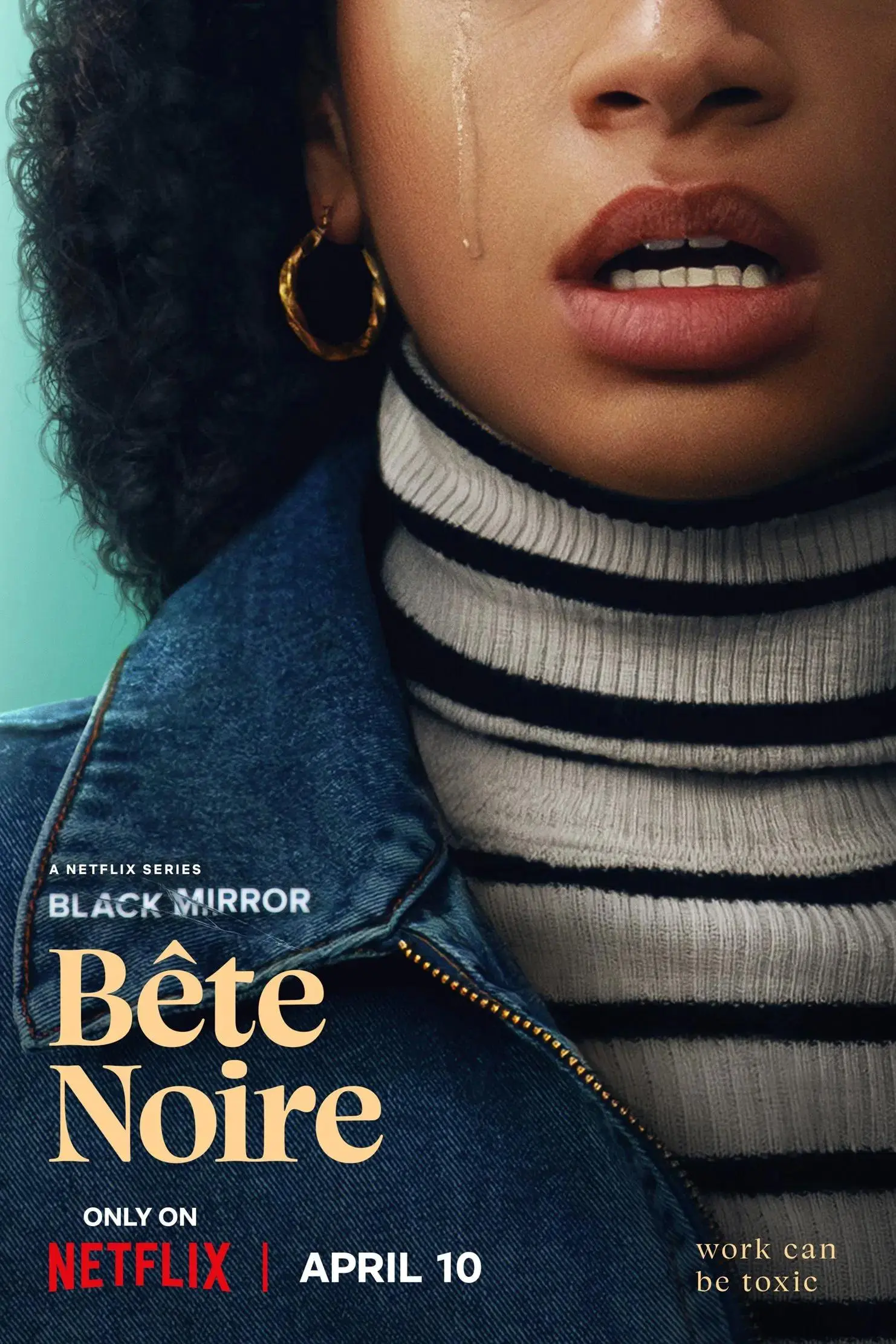
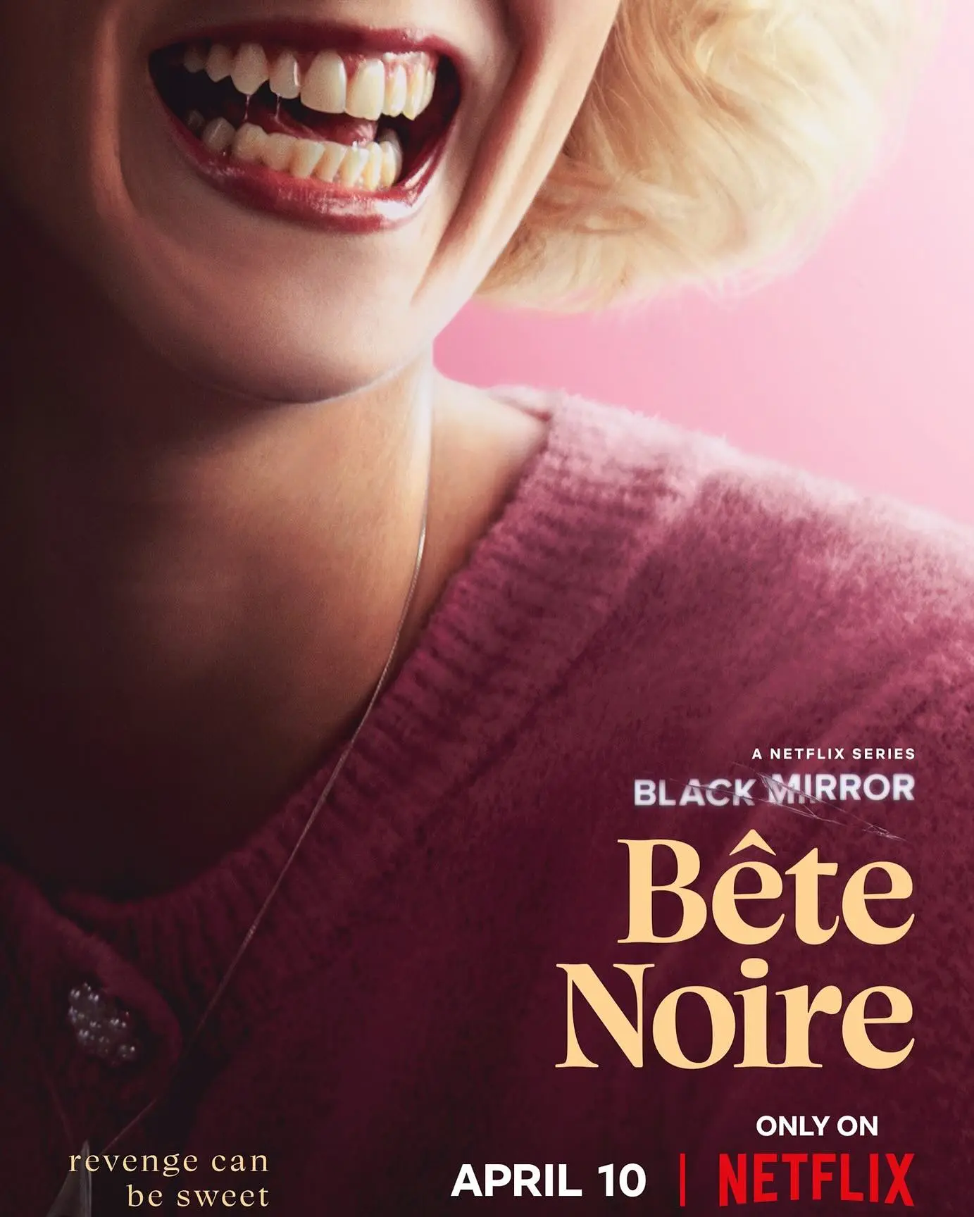
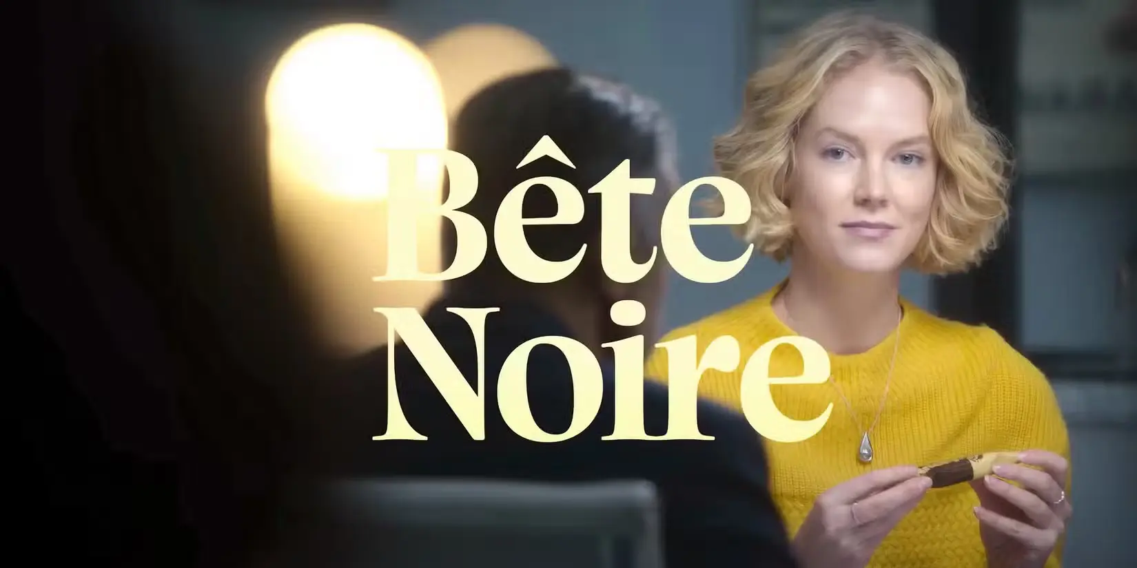
Black Mirror Season 7 “Bête Noire”
The chilling title sequence and in-world corporate branding for Black Mirror's "Bête Noire" leverage the elegant Charlea font to set a perfectly unsettling cinematic tone.
Client Netflix / Black Mirror
Film & TV
“Bête Noire,” the gripping second episode of Black Mirror’s seventh season, explores the dark side of reality manipulation and corporate greed. Produced by Netflix, the episode features meticulous in-world graphic design and title sequencing crafted by graphic designer Sam Morley and production designer Miranda Jones. Their work brilliantly brings the fictional Ditta confectionery company to life, contrasting a polished, high-end corporate aesthetic with the intense psychological horror unfolding beneath the surface.
To achieve this delicate balance, the Charlea font by Kereatype was selected for the episode’s title and key typographic elements. Its sleek, modern serifs and subtly sharp curves provide an elegant yet menacing atmosphere that perfectly complements the episode’s themes of distorted reality. The high-contrast letterforms demand attention while maintaining a sophisticated cinematic feel, making it an ideal choice for a psychological thriller.
Production: Broke and Bones / Netflix
Director: Toby Haynes
Graphic Designer (Screen & Prop Design): Sam Morley
Project Showcase
Stay in the loop with
our latest news
Copyright © 2026 Kereatype Studio. All rights reserved.
KEREATYPE